
What is Color Psychology?
Color Psychology is the study of how colors affect perception and human behavior. Humans have been studying the effects of color for thousands of years and we've learned that first impressions are made subconsciously within seconds and COLORS are a big part of those impressions. That's why it's SO important to consider color when creating a brand and marketing a product or service.
Facts About Color in Marketing
- The Seoul International Color Expo did a study which showed over 90 percent of buyers focus on visual appearance.
- Colors evoke different emotions.
- Black and white color schemes cause more people to forget the information than any other color combinations.
- The reason you never see yellow in an airplane is because, the color yellow can cause dizziness or nausea.
- Wearing black can make you appear more powerful.
- Men and women see red differently.
- Blue is the world's favorite color.
- Colors increase brand awareness by 80%.
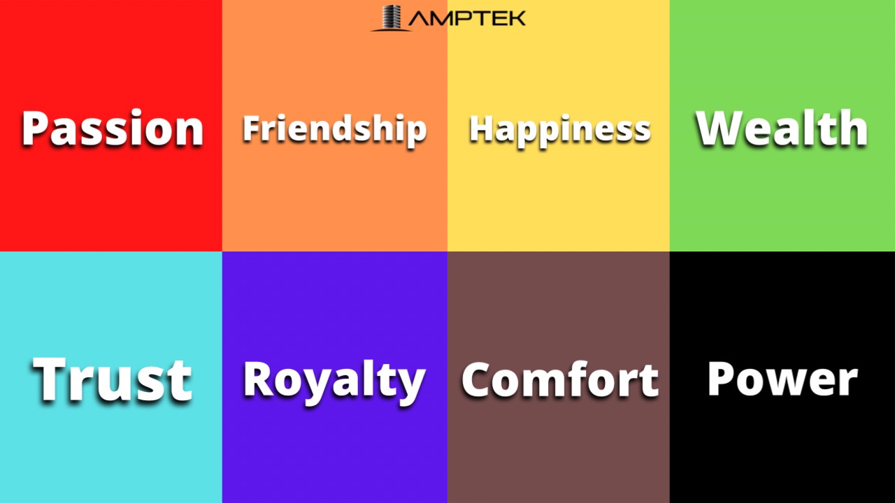
Color Meanings
Colors used for immediate recognition:
Red
- Has a powerful presence of excitement, passion, and energy that attracts attention quickly.
-Used in packaging, on 'Order Now' buttons online, and "call to action" sale icons. - CAUTION: Evokes love and passion or terror and fear so use cautiously.
- Examples: a stop sign, Valentine's Day, Horror films, Coca Cola brand, Youtube
Orange
- Represents physical comfort and warmth, can stimulate the appetite or add an element of fun.
-Also used for calls to action. - Creates feelings of success, motivation, enthusiasm, creativity, adventure and a positive attitude.
- Examples: fruits, sporting events, kid-friendly shows or toys
Yellow
- Has one of the longest wavelengths making it one of the most powerful colors, and it's the easiest to see.
- Creates feelings of joy, summertime, happiness, cheerfulness, and optimism.
-Used as background or accent colors on websites or for free buttons like 'free shipping' - CAUTION: can also cause feelings of fear and anxiety if used too much.
- Examples: traffic caution signs, smiley faces, window front displays, Ferrari
Green
- Associated with balance and harmony.
- Reflects life, rest, and peace within nature as well as wealth, generosity, fertility, and prosperity within culture.
- CAUTION: Can have a negative emotion of envy.
- Examples: money signs, health, peace sign, John Deere Tractor
Blue
- Known for trust, stability, and dependability providing a sense of mental soothing.
- Evokes calm, relaxed, and comfortable feelings.
-Used for trust certifications and free shipping buttons online. - CAUTION: one of the last colors to be seen and can come off as distant and unfriendly.
- Examples: Spas, gyms, hospitals, Oral B, Walmart
Purple
- Represents spirituality and imagination.
- Portrays luxury, power, nobility, wisdom, loyalty, courage, magic, and mystery.
- CAUTION: too much purple can cause feelings of frustration.
- Examples: magic shows, royalty, fairytales, SyFy, Hallmark, Yahoo
Brown
- Earthy color that symbolizes security, structure and protection.
-Often used in natural products and food. - Creates feelings of comfort and seriousness.
- Examples: coffee, campgrounds, home furnishings, UPS logo
Black
- The color of sophistication, elegance, seriousness, control, and independence
-Used by many fashion retailers use it in logos to symbolize elegance. - Great for creating contrast and easy legibility/readability.
- CAUTION: often expresses death, evil, mystery and depression.
- Examples: luxury brands like Chanel, professional attire, evil characters in books and films
How to use Color Correctly
Contrast and Tone
Contrast is how one color stands out apart from another. High or low contrast is the degree in which the colors stand out from one another. High contrast is usually best, but you don't want everything in high contrast or it will all blend together. Make sure your important info is in high contrast (dark on light, light on dark). Different colors do not automatically create contrast. Tone plays a big role as well. Tone is the lightness or darkness of a color by adding white or black to that color. The right variance in tone and color create the best contrast.
Color Combinations
The color wheel is great for choosing the right color combinations used in lead collection pop-ups, call to action buttons, and infographics. Remember that simple is better, because it makes it easier for your audience to read and comprehend. Use complementary colors so they stand out more. Complementary colors are opposite of each other on the color wheel, because they have the least amount of the opposite color. The difference in colors creates the best contrast. Many sports teams use complementary colors in their branding like The Lakers or The Knicks. Split-complementary colors use one base color and two colors adjacent to its opposite. For Example, if you used yellow as your base, the two other colors would be the blue and magenta colors next to the purple, which is opposite of yellow.

CAUTIONS:
- Don't use 50% one color and 50% the complementary color because it causes distress to the eye and neither color wins.
- People who are color blind have a difficult time seeing red and green combinations.
PRO TIP: pick a primary color as your main color, and then accent it with its complementary color for more of a 7:3 ratio.
Analogous Colors
- Colors that are next to each other on the color wheel like blue and purple.
- They create subtle and beautiful content, but it might be good to add a complementary color to make a specific item stand out.
Monochromatic Colors
- Single color with tones, tints, and shades.
- They are more subtle than analogous colors, because they are from one color.
- They work great when paired with one complementary color.
PRO TIP: Bright colors promote physical activity but make the passage of time seem slower. While cooler and softer colors are better for mental activity and make the time seem to fly by.
Cultural Colors
- In various cultures, colors can mean different things. This is an important factor, when developing branding for a specific audience.
- For example, in Africa red means death, but in Asia it means prosperity.
How to use colors for your business:
- Pick a color that best represents the brand's personality and your target audience.
- For example; pink identified with feminine hygiene products.
- Pick two main colors for your logo, so that it's easy for your customers to identify.
- Build your website around your logo colors and what appeals to your target audience.
- Use bright secondary colors for your "call to action" buttons.
- Make sure your brand colors are consistent throughout all platforms your business is represented on (i.e. social media, letterheads, business cards, etc.)
5 ways color psychology can help your business:
- Social media profiles and content: present your product, service, or yourself in the best possible fashion.
- Logos: create the most appealing image that evokes good emotions to represent you or your products and services.
- Packaging: know what colors will attract the most customers.
- Advertisements: capture the attention of people viewing more effectively.
- Brand Personality: embody the most appropriate personality that portrays your brand.
While there is a lot of controversy about the effects of color on branding and marketing, there is still a lot of useful information that can help you test which colors work for your brand. There are a lot of options so carefully choose which unique color palette works best for you. Now it's time to apply these tips and tricks to your business plan.
To find out more about using LinkedIn to grow your business, book an appointment with one of Amptek Growth's Account Executives today!

